Moonshot 1970: Moments to Touchdown
A reimagining in 3D of the cover illustration on the 1967 book "Moonshot 1970"
Exploring the intersection of spaceflight history, pop culture, and space art.
Creating Space kicks off the year with some new artwork featuring my favorite space vehicle, the Apollo Lunar Module.
Are you new to Creating Space? It’s the NERDSletter that explores the intersection of spaceflight history, pop culture, and space art. You can find this and all other posts at creating-space.art.
New Space Art of the Month
Moonshot 1970: Moments to Touchdown
A reimagining in 3D of the cover illustration on the 1967 book Moonshot 1970. Written by Martha Lomask, illustrated by Gordon Mellor. The Apollo Lunar Excursion Module (LEM) is moments from touching down on its landing spot, illuminated in part by the soft blue Earthlight. The sky is dotted with brilliant stars and is filled with bright cloud-like areas of color. The Earth is shown as a cloudless globe. An elongated Apollo Command and Service Module streaks overhead. Modeled and rendered in 3D, the image echoes the style of the children's book.
The Inspiration
Moonshot 1970: Moments to Touchdown is the latest in my series in the design evolution of the Apollo Lunar Module. So far, I have recreated the 1962 concept that came out of the NASA Langley center, the initial Grumman proposal from 1962 transformed into a bubble gum machine, and a simplified version of the flown Lunar Module rendered in a toy-like style.

The Lunar Module has been an object of fascination for me since I was a kid in the 1960s. It is the embodiment of the idea of form following function. Essentially nothing is added merely for the sake of visual appeal. Every part of this spacecraft has been truly crafted for use in space. Seeing how the design evolved in such a short time, from its initial concepts in 1962 to the firming up of the design by 1967, gave me my first real sense of how engineering concepts are developed and refined.
My artistic inspiration for my latest Lunar Module artwork came from a 1967 children’s book called Moonshot 1970. I’ll bring you inside the book in an upcoming post, but for now I will focus on the cover illustration.
My particular copy of the book was an eBay find, but it originally came as a free premium with Thrill dish detergent. I am sure moms everywhere were indeed thrilled to receive the free space-age gift with their regular shopping list items. Their little future astronauts were likely even more excited to receive the surprise when they got home.
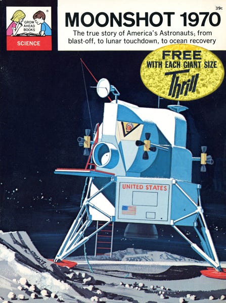
I chose this version to be the next in my Lunar Module series because I saw it as an opportunity to try to emulate the illustration style using my 3D modeling program, Blender. My earlier Lunar Module scenes were rendered more realistically.
I began by reproducing the scene on the front cover. This way, I would be able to match the proportions and shapes of the Lunar Module in the illustration. Ultimately, I would create a new scene with the same modeled elements in a different way.
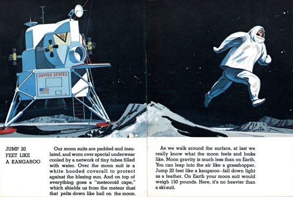
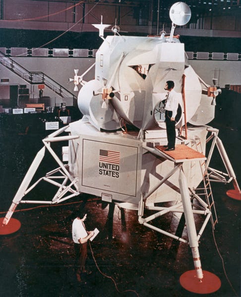
The cover scene is repeated inside the book, but mirrored. I chose to use this flipped orientation since it placed elements such as the ladder and rope on the correct side as compared to photos of a similar mockup at Grumman’s factory, seen farther down in this post.
A Mishmash of Modules
Artists often take shortcuts when creating illustrations, particularly when the work is destined for children’s books. They may simplify their drawing for clarity or to help tell a story. And, more times than you might think, they don’t get things quite right. The Lunar Module’s complex shapes and angles make it one of the more difficult objects to accurately draw. I often see missed perspective, wrongly sized components, and sometimes even impossible shapes that may look good in a two-dimensional drawing but would not work in three dimensions.
In this case, however, modeling the book cover’s LEM in three dimensions revealed that the artist’s rendition was actually very true to form. He may very well have referenced a contractor model on his drawing board while working on his illustration.
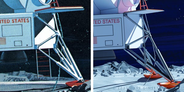
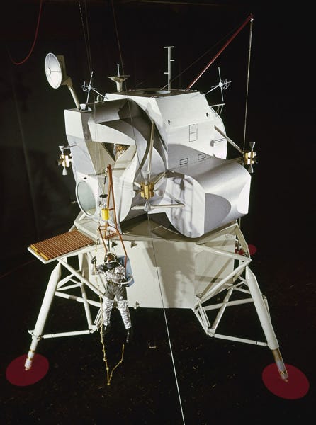
Here, side-by-side, are the book’s LEM illustration, my 3D rendering, and a 1963 contractor model with a similar configuration. I flipped the photo of the model for easier comparison.
The rendering shows that the 2D illustration works in 3D. And, compared to the contractor model, I think the artist did a fine job maintaining accuracy, proportion, and perspective in adapting this LEM configuration to a children’s book.
The eagle-eyed viewer might notice a few differences between the illustration, my 3D rendering, and the contractor model.
Perhaps the most obvious difference is the oversized porch in front of the forward hatch, which is shown in the illustration and my rendering, but absent from the contractor model. A ladder is seen in the illustration, and is present in my rendering, but is again missing from the contractor model.
These two elements – the porch and ladder – might seem essential to completing the last few feet of the long trip to the Moon’s surface. However, prior design concepts seemed to overlook any means for the astronauts to get down out of the LEM, and perhaps more importantly, to get back up and into the spacecraft.
The only exception that comes to my mind is the original 1962 Grumman proposal which included a fold-up front porch, but no ladder. For a while afterwards, the porch and ladder were conspicuously absent in concept illustrations and models. Maybe designers were counting on the reduced lunar gravity to make the last giant leap from the hatch to the surface seem more like a small step.

The next time these elements appeared in the design evolution of the LEM seems to have been on a Grumman factory mockup, called TM-1, used for astronaut mobility and egress/ingress tests in March of 1964. By some accounts, prior to the evaluations some Grumman engineers believed that a simple knotted rope would be all anyone would need. This mockup would be used to put that theory to the test.
This excerpt from Chariots for Apollo: A History of Manned Lunar Spacecraft1 describes the test and the outcome.
Once the location of the hatches was settled, getting the astronauts out and onto the lunar surface had to be investigated. Using a cable contraption called a "Peter Pan rig" to simulate the moon's gravity, Grumman technicians looked into ways for the crews to lower themselves to the lunar surface and to climb back into the spacecraft. When astronaut Edward White, among others, scrambled around a mockup of the lander, using a block and tackle arrangement and a simple knotted rope, he found that both were impractical. In mid-1964 a porch, or ledge, was installed outside the hatch and a ladder and handrail on the forward landing gear leg.
The book illustrator likely borrowed the rope and its support structure from the TM-1 mockup. He also included the overhead crane that can be seen in the mockup photo. I recall reading (though I can’t remember where) that the crane was used to lift and move equipment around the mockup, but was never intended to be part of the spacecraft. The artist can be forgiven for failing to make this distinction among the many parts scattered around the ungainly contraption. “If I sees it, I draws it.” may have been his guiding philosophy in this case.
The antennae configuration and orange footpad color also seem to be taken from the mockup. By the way, if I am not mistaken, that may be Gemini, Apollo, and Skylab astronaut Charles ‘Pete’ Conrad suspended in the harness.2
In this view of the mockup you can see an early ladder concept installed and in a deployed position, situated close to the front porch.
This was one thing that modeling in 3D revealed about the Moonshot artist’s impression. In order to better show the ladder, the artist “cheated” reality by moving the ladder back to a side of the LEM farther from the porch than would actually be practical. In fact, upon close inspection, the illustrator placed the ladder behind the port side landing leg! Sometimes, a little accuracy must be sacrificed for the sake of clarity.
In an upcoming post, I will take you inside Moonshot 1970, the book.
Merch of the Month
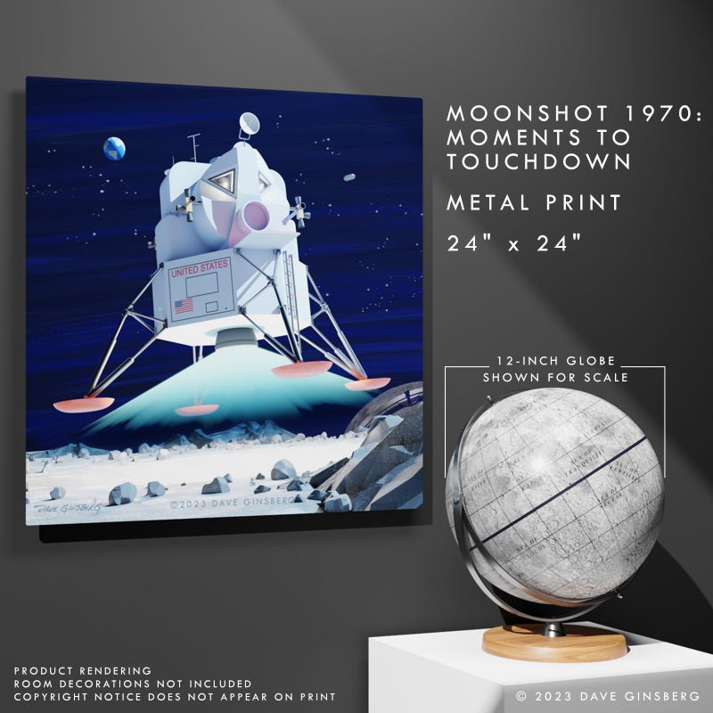
Moonshot 1970: Moments to Touchdown Metal Print
Moonshot 1970: Moments to Touchdown is a reimagining in 3D of the cover illustration on the 1967 book "Moonshot 1970". Written by Martha Lomask, illustrated by Gordon Mellor. The Apollo Lunar Excursion Module (LEM) is moments from touching down on its landing spot, illuminated in part by the soft blue Earthlight.
SOCIAL IMPACT
Your purchase from Pixel Planet Pictures helps support and promote space-related STEAM organizations and initiatives that enable and inspire students and youth to learn, develop, and pursue passions in science, technology, engineering, arts, and math.
Art News
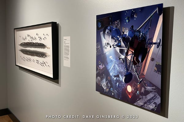
The Art+Flight exhibition at the Museum of Flight in Seattle, Washington, came to a close on January 7, 2024. My space-inspired artwork, Moonlight Dreams, was on display for seven months.
I have previously rewritten about the art exhibit in the following two posts.
Art News from Moonlight Dreams post, June 4, 2023
Art News from The collectSPACE Insignia post, July 8, 2023
Moonlight Dreams is still offered for sale at the Museum’s store, and is always available in a variety of formats in my online shop.
I’m Dave Ginsberg, the artist behind Pixel Planet Pictures and writer of Creating Space.
I am an artist and a creative engineer with a love for teaching and passions for spaceflight, astronomy, and science. My space-inspired art portfolio can be found at pixel-planet-pictures.com.
Do you know fellow Space Geeks who might enjoy Creating Space? Invite them into this space, too!
Did you miss a post? Catch up here.
If you enjoyed this article please hit the ‘Like’ button and feel free to comment.
All images and text copyright © Dave Ginsberg, unless otherwise noted. All rights reserved.
Chariots for Apollo: A History of Manned Lunar Spacecraft, Courtney G Brooks, James M. Grimwood, Loyd S. Swenson, NASA Special Publication-4205, 1979, ch.6
Moon Lander: How We Developed the Apollo Lunar Module, Thomas J. Kelly, Smithsonian Institution Press, 2001, p.89-91










Hi Dave,
You're welcome and thank you for using your talent in this awesome and wonderful way you created. This is a very unique way to teach space history and to inspire across generations.
This for me was a wonderful revisit to an era gone by! My childhood excitement seeing this type of art reminded me of this making the news cycles in the space race stories of the U.S. versus Russia. With this art the writers were teaching us what NASA (we collectively) were learning and advancing on. Dave captured that moment very well and authentically! If you were not "born in time to live it" and are a student of space history, Dave's art is a bullseye on how the word was spread and how we learned the 'how to' plans back in those early days from Mercury through Gemini and APOLLO development. The pace was at a speed record pace every two months on average with Gemini. Not one Gemini flight plan was repeated for a lack of failing to learn. Only too perfect because APOLLO had to be 100% error free with the flight mechanics. No second chances.